The polar bears | Icy Polar Opposites
Dublin
Team Updates
Our GitHub repository with documentation on our API: https://github.com/dmateusp/icy-polar-opposites
The app is now live here: https://icypolaropposites.herokuapp.com/

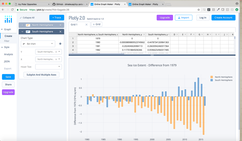
Surprised by our data visualization bar chart: it looks like Antarctic is gaining ice while the Arctic is losing ice over the years, although in total the ice is still diminishing.

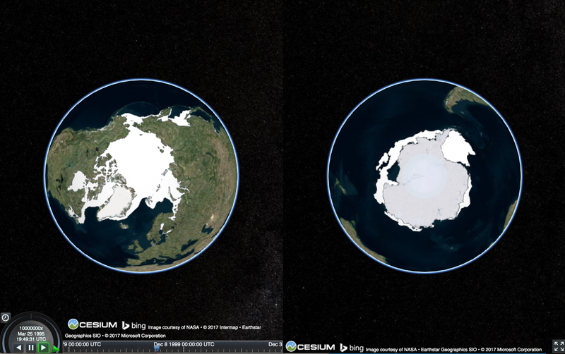
data visualization of sea ice extend change on 3D globes with interactive time line
SpaceApps is a NASA incubator innovation program.